Oakton College Master Plan Community Display
Translating a complex master planning methodology into an approachable, interactive experience for an entire campus community
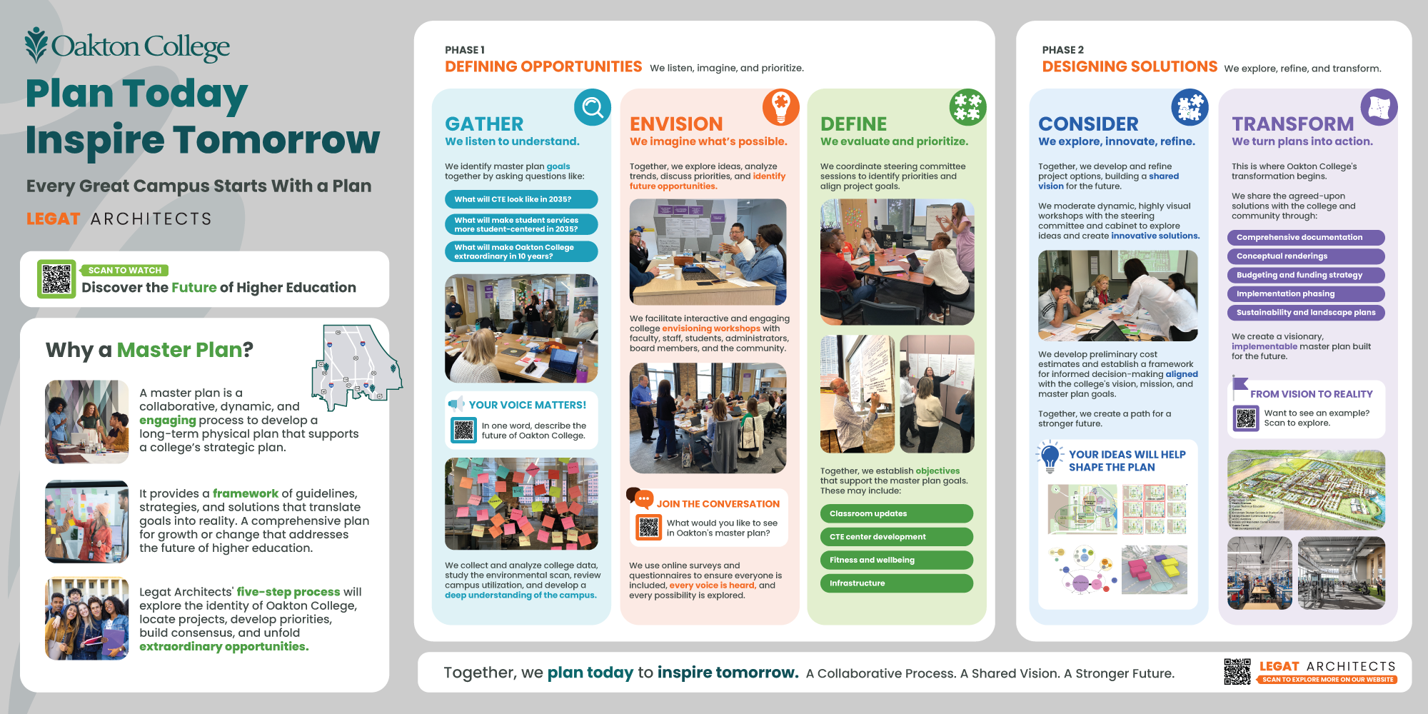
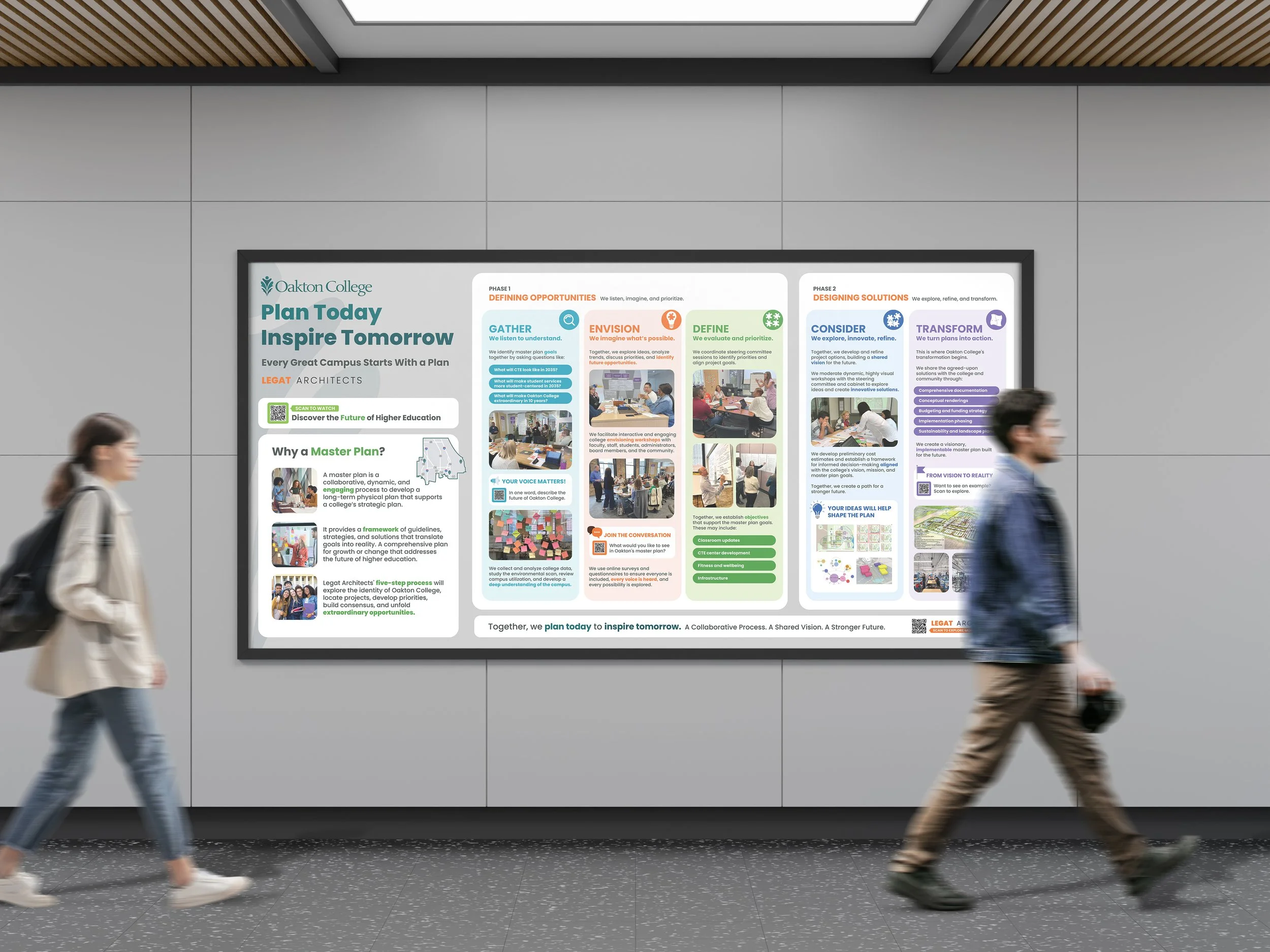
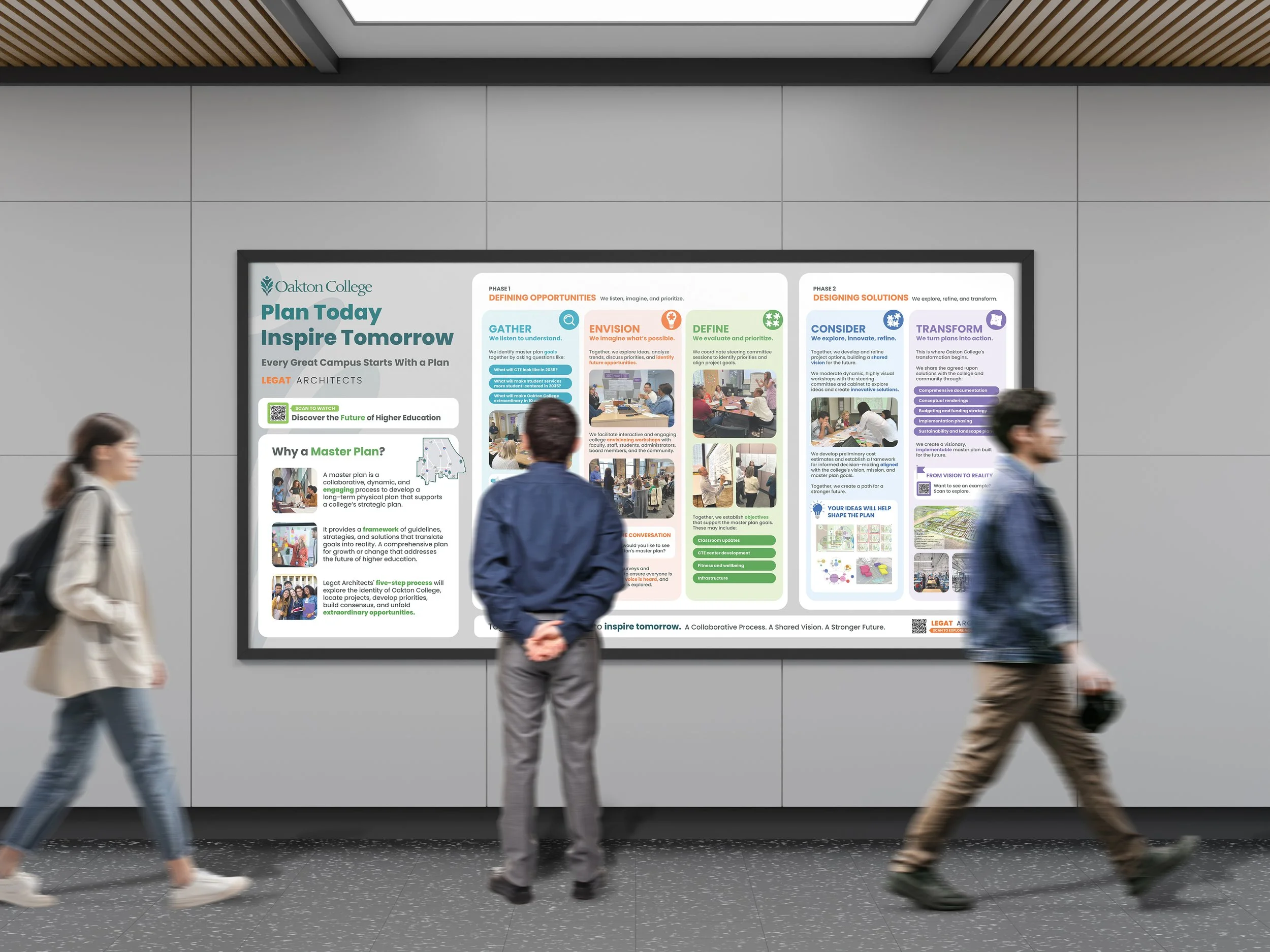
After being shortlisted for Oakton College’s master planning project, our team was asked to create a 4' × 8' community display highlighting our master planning methodology and approach to stakeholder engagement. Designed for public display across both campuses, the piece needed to communicate a complex planning process to a broad audience of students, faculty, staff, and campus leadership.
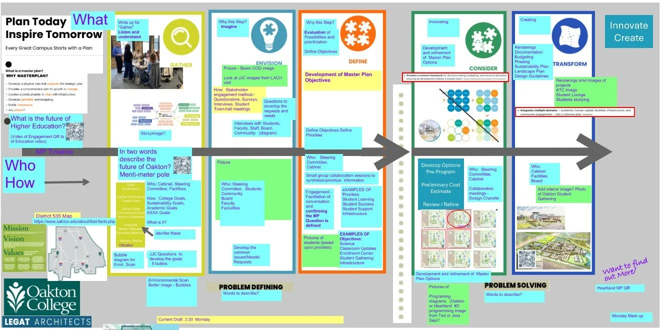
Working from an established content framework and rough organizational mockups, I led the visual strategy and design of the display - translating the methodology into an approachable visual narrative and introducing interactive touchpoints that invited the campus community to engage with the planning process.
ROLE
Visual Strategy, Information Design, Graphic Design & Production
PROJECT TYPE
Pursuit Marketing, Community Engagement
CLIENT
Oakton College
TOOLS USED
Adobe Illustrator, Photoshop, Bluebeam
The Challenge
Designing for people who don’t speak “master planning”
Our project team was deeply familiar with master planning, but much of the poster’s audience would not be. Displayed in high-traffic areas on both campuses, the piece needed to communicate with students, faculty, staff, and campus leaders - many of whom might only encounter it briefly while passing by.
The challenge was not simply to present our five-phase methodology. It was to make a complex professional process approachable at a glance, help people understand why master planning matters to the spaces they use every day, and create enough interest to invite them into the conversation.
COMPLEXITY
A professional five-phase methodology with multiple layers of information.

AUDIENCE
A broad campus community with varying levels of familiarity with master planning.

ENVIRONMENT
A large-format display competing for attention in busy, high-traffic campus spaces.
How could we turn an expert-driven planning methodology into something the campus community could quickly understand, relate to, and participate in?
The Insight
Shift the story from process-first to people-first
Our team naturally viewed master planning through the lens of the process. But for students, faculty, and staff encountering the display in their everyday campus environment, the process alone wasn’t the starting point.
I realized the story first needed to answer the questions most relevant to them:
What is a master plan? Why does it matter to me? And how could it shape the places I use every day?

The Approach
Turning understanding into engagement
With a broad audience and a busy campus setting in mind, I approached the display as a layered communication experience rather than a linear presentation of information. It needed to capture attention from a distance, make complex ideas easy to understand up close, and give viewers a reason to stay engaged as they moved through the content.
I structured the experience to progressively move the audience from understanding to engagement - starting with why master planning matters, creating a clear visual path through the five-phase process, and embedding opportunities for participation along the way.
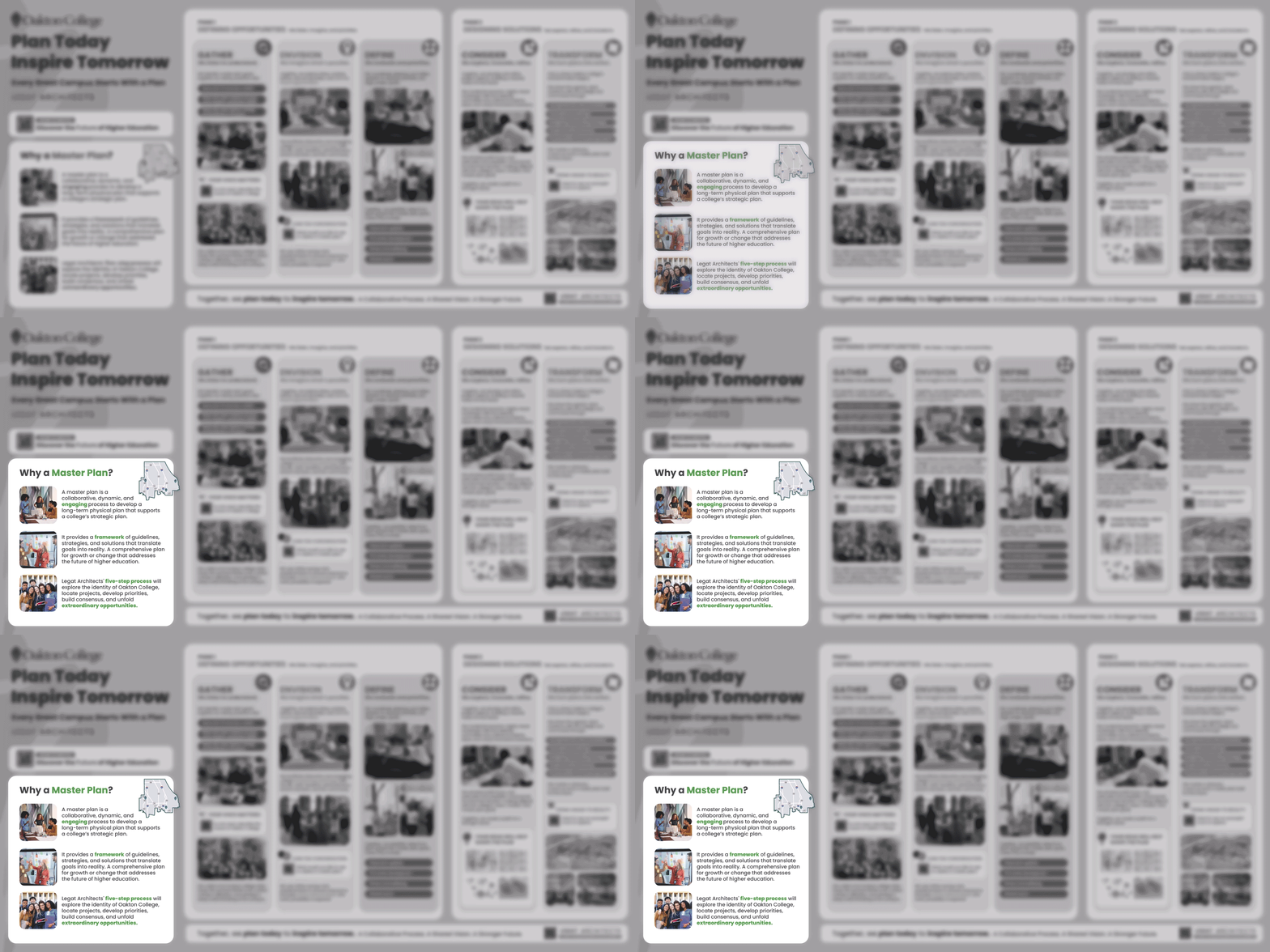
START WITH WHY
Make master planning relevant before explaining the process.
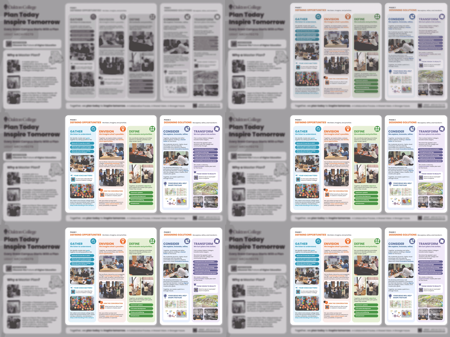
CREATE A CLEAR PATH
Turn a complex methodology into an easy-to-follow visual journey.
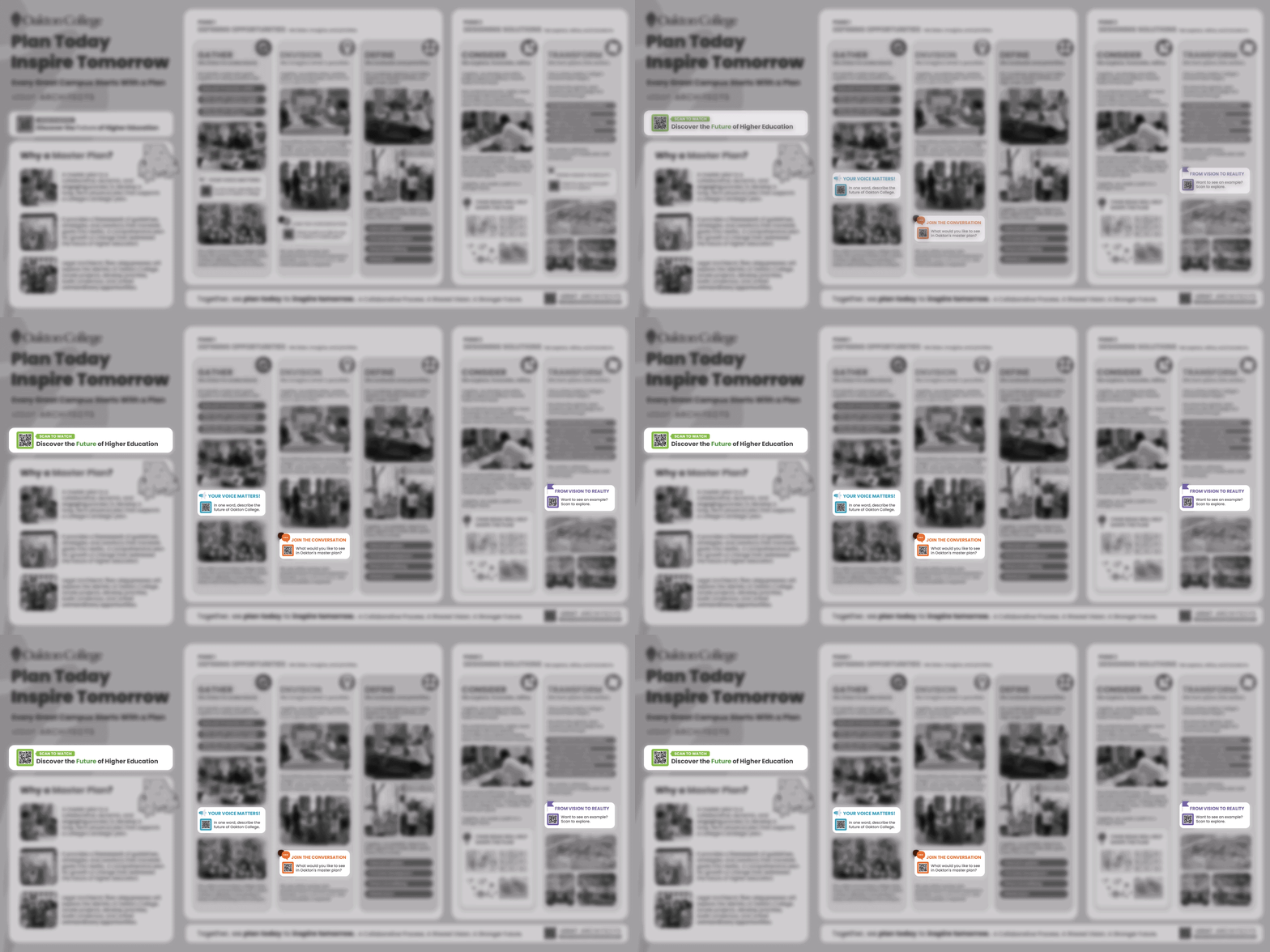
BUILD PARTICIPATION INTO THE JOURNEY
Create opportunities to engage along the way - not just at the end.
Designing the Experience
Turning strategy into a visual system
01
START WITH WHY
Rather than leading immediately with the five-phase methodology, I created an entry point that first established what master planning is and why it matters. Concise explanations, relatable campus imagery, and real-world examples helped connect an abstract planning process to the spaces and experiences the Oakton community encounters every day.
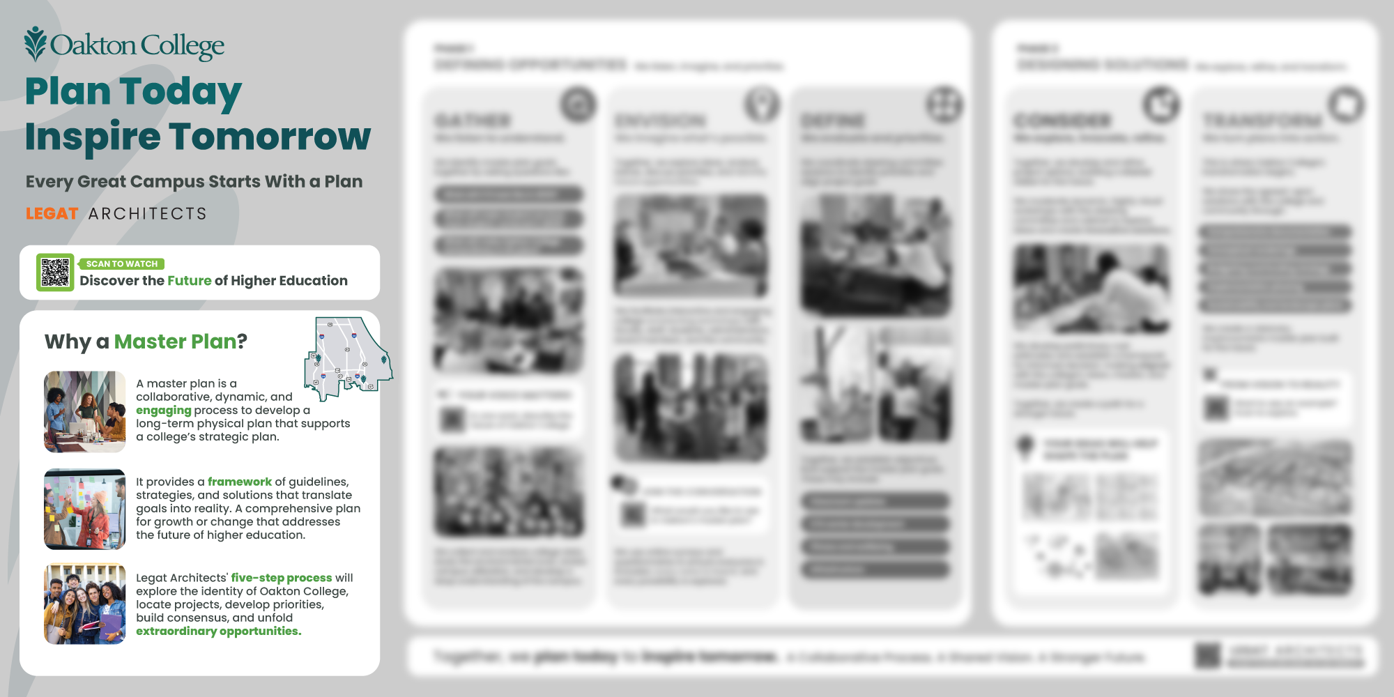
02
CREATE A CLEAR PATH
I translated the five-phase methodology into a consistent visual system that made the process easy to scan and follow. Each phase was given a distinct visual identity while maintaining a shared structure, helping viewers understand both the overall journey and what happens at each step.
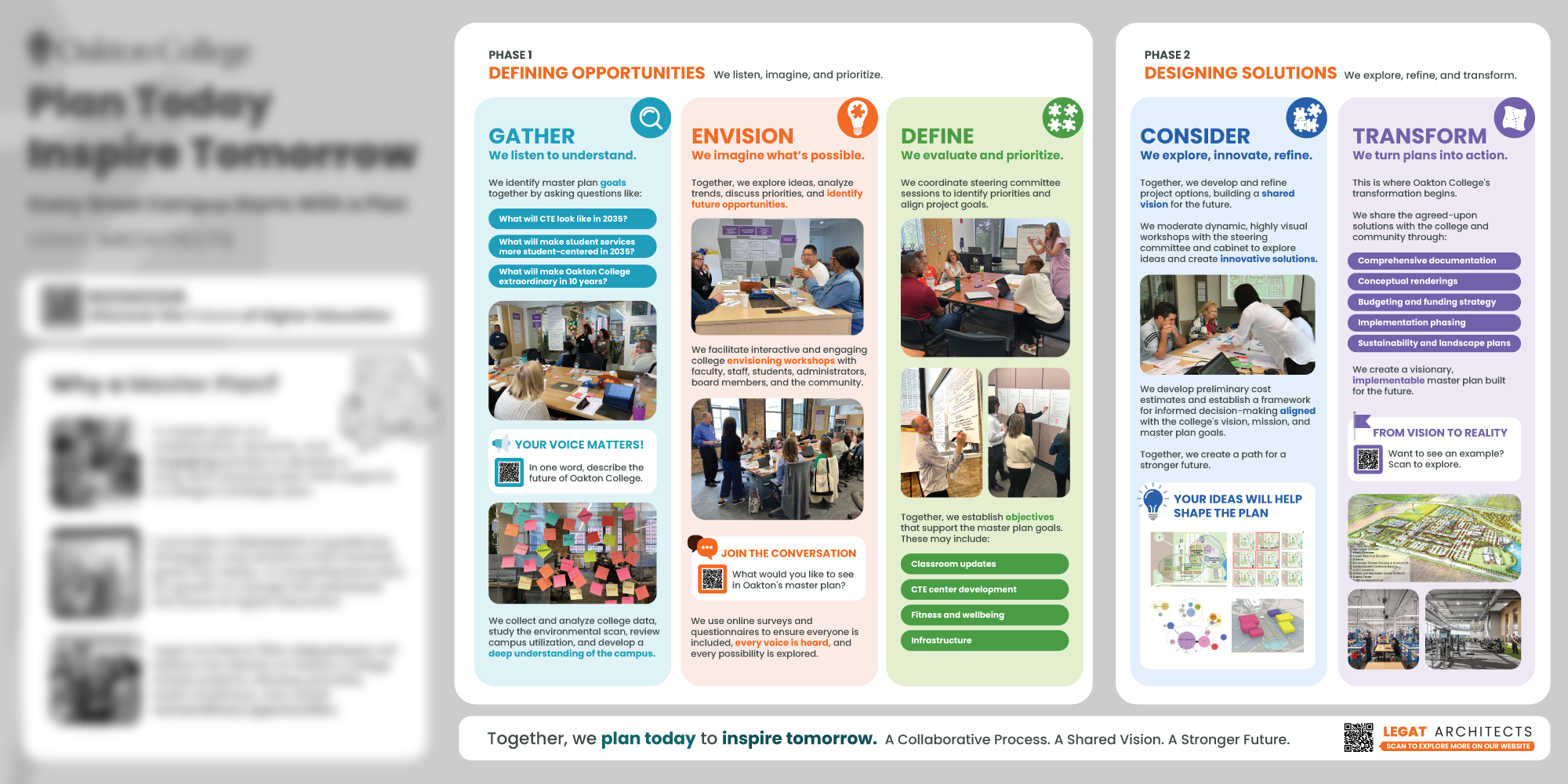
03
BUILD PARTICIPATION INTO THE JOURNEY
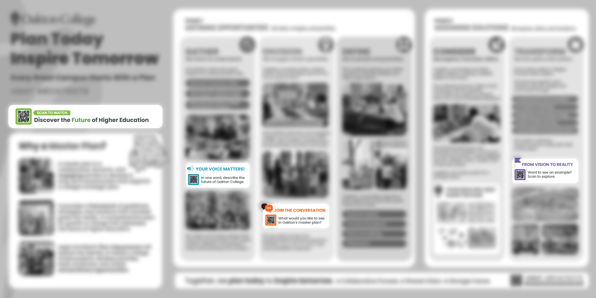
I introduced QR-based touchpoints as a way to extend the display beyond passive viewing and invite the campus community into the conversation. Working with the project directors, we developed questions and linked content relevant to different parts of the planning process.
Rather than grouping the interactive calls to action at the end of the board, I proposed embedding them within the phases where they were most relevant. This created recurring moments of engagement throughout the display while connecting community input directly to the planning process.
Engagement wasn’t added at the end. It was built into the journey.
The Final Experience
The final 4' × 8' display brought together education, visual storytelling, and community engagement in a single experience—designed to capture attention from a distance, communicate complexity up close, and invite participation throughout the journey.