Wind and Wave Acupuncture Clinic
Inspired by movement, grounded in balance
Wind and Wave is an acupuncture clinic rooted in the idea of restoring balance through natural, holistic care. The brand identity translates the movement of wind and water into a calm, modern visual language that reflects the clinic’s focus on harmony and well-being.
ROLE
Brand Strategy, Concept Development, Visual Identity
PROJECT TYPE
Brand Identity Design
CLIENT
Wind and Wave Acupuncture Clinic
TOOLS USED
Adobe Illustrator, Photoshop
The Challenge
Translating movement and balance into a tangible identity
Wind and Wave’s name draws from the natural forces of movement and balance, reflecting acupuncture’s focus on restoring equilibrium. The challenge was to translate these abstract ideas into a clear, versatile identity that felt organic and restorative while maintaining the professionalism and trust of a healthcare practice.
With a clientele of urban professionals and city dwellers in downtown Chicago, the identity also needed a contemporary, approachable sensibility that could adapt seamlessly across print and digital applications.

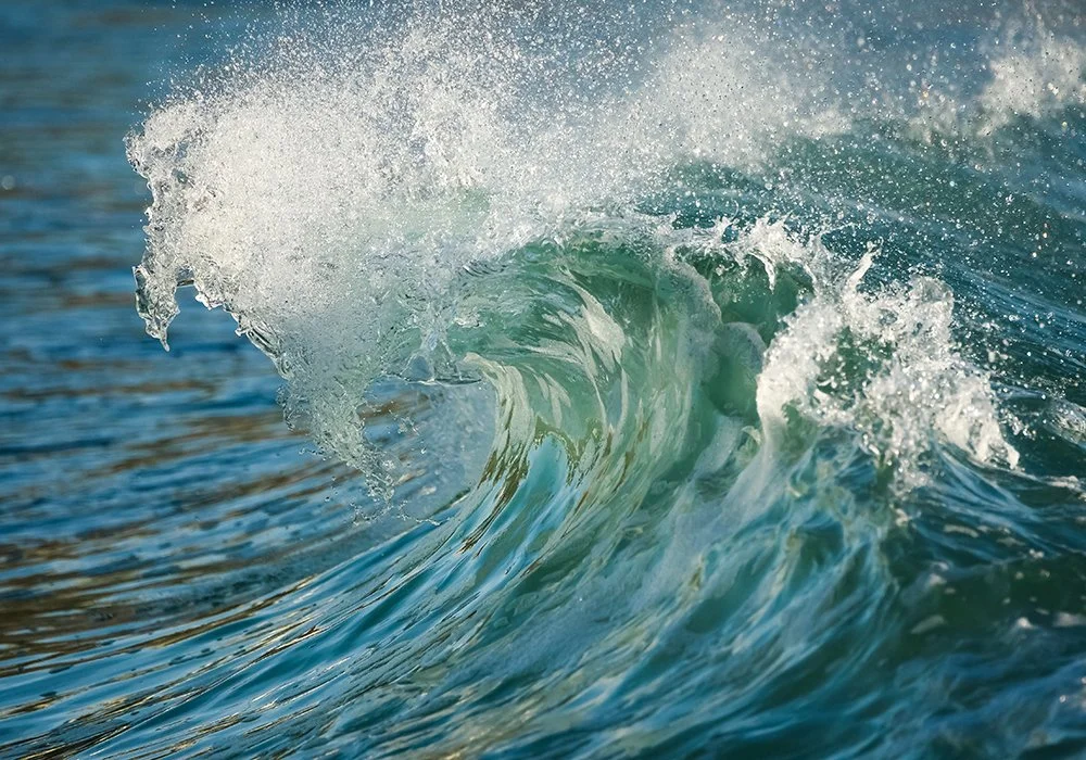
Finding the Visual Language
Drawing inspiration from nature’s movement and rhythm
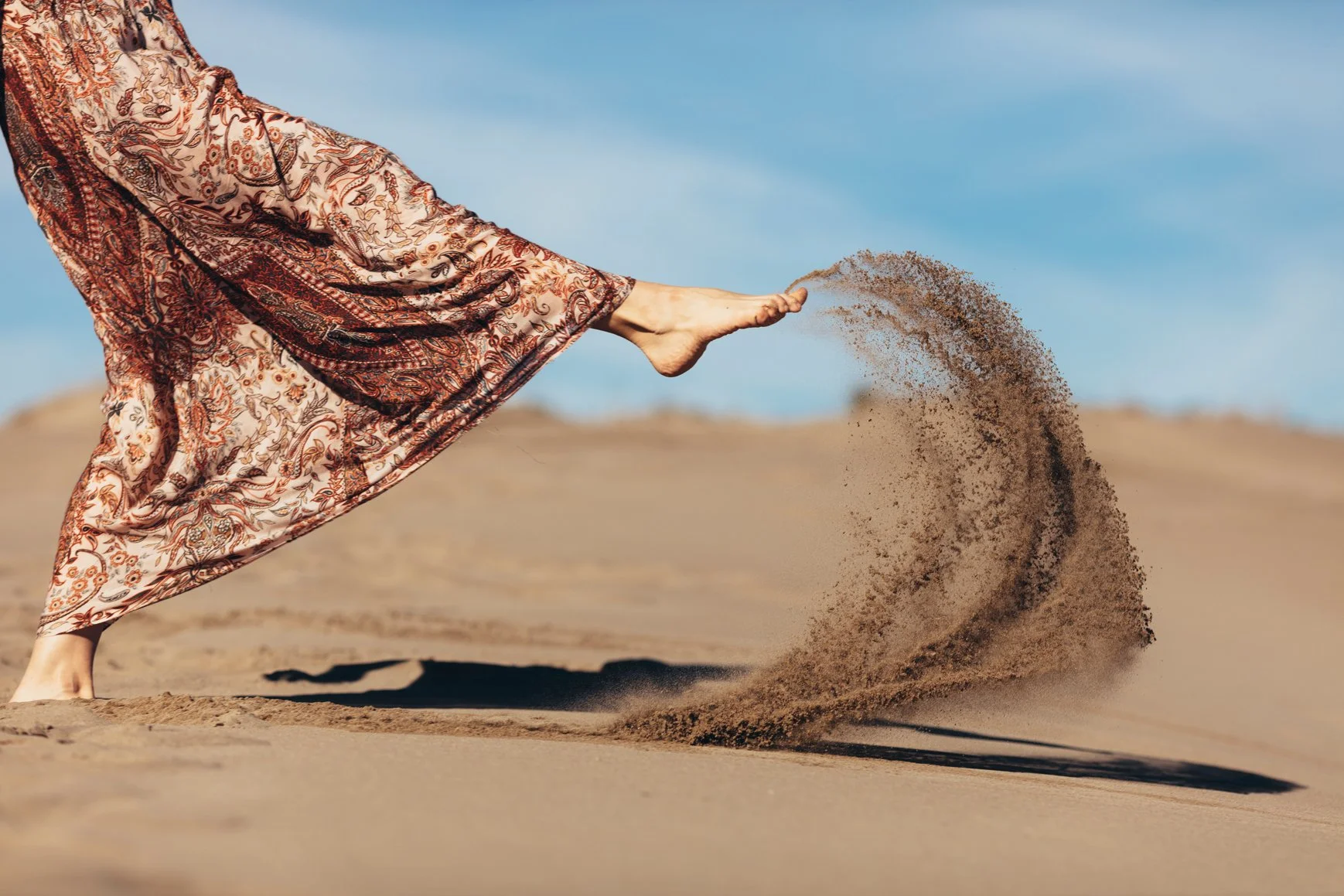
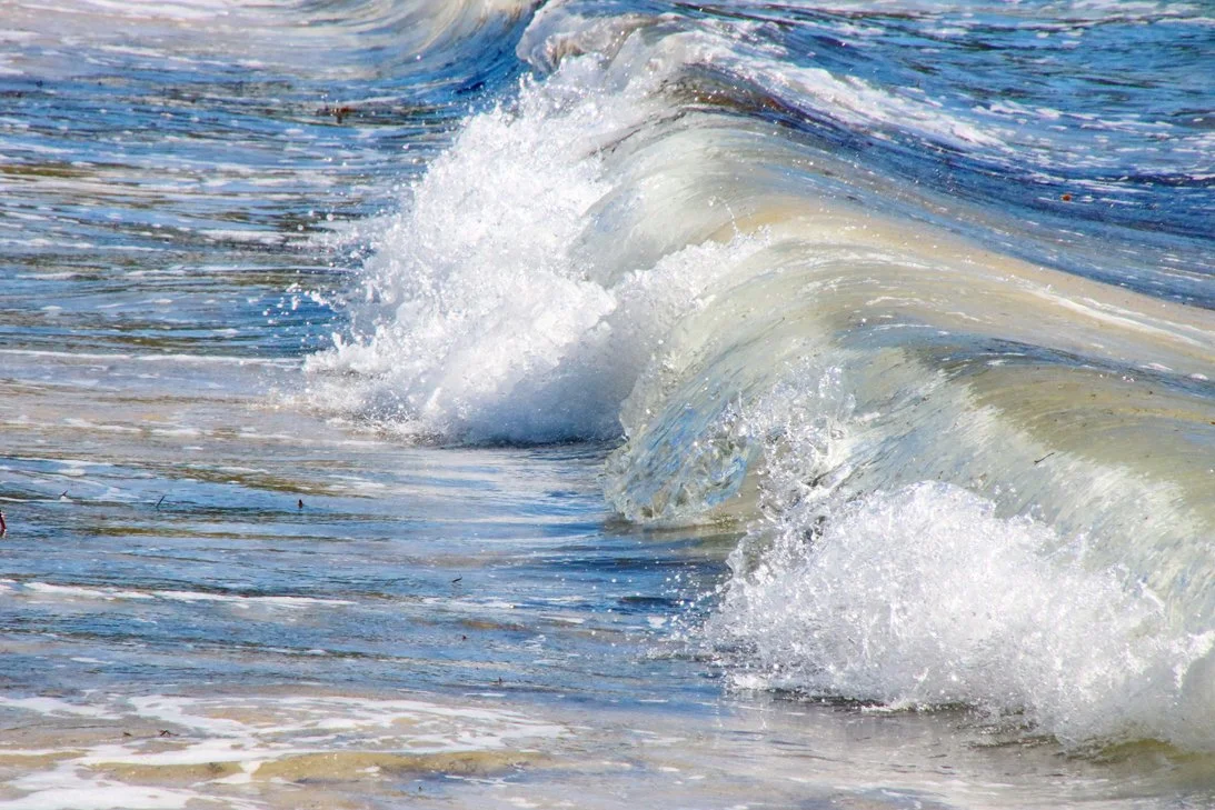
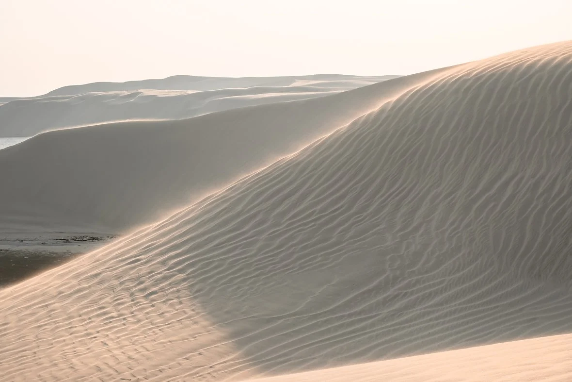
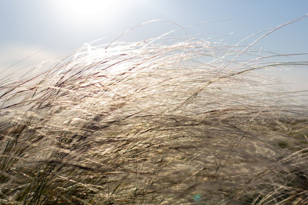
The visual direction began with the natural qualities behind the Wind and Wave name. Flowing water, shifting landscapes, and organic forms became references for movement and renewal, while softer textures and neutral tones introduced a sense of calm and balance.
These references shaped a visual language that felt modern and organic, pairing cool blues with warm, grounded neutrals to reflect both the energy of movement and the restorative nature of the practice.


Color Palette
STILL WATER
COASTAL AIR
RIVER STONE
DRIFTWOOD
Brand Keywords
BALANCE
RENEWAL
ENERGY IN MOTION
CLARITY
ORGANIC
MODERN
Translating Motion into Form
Transforming the movement of wind and water into a unified mark.
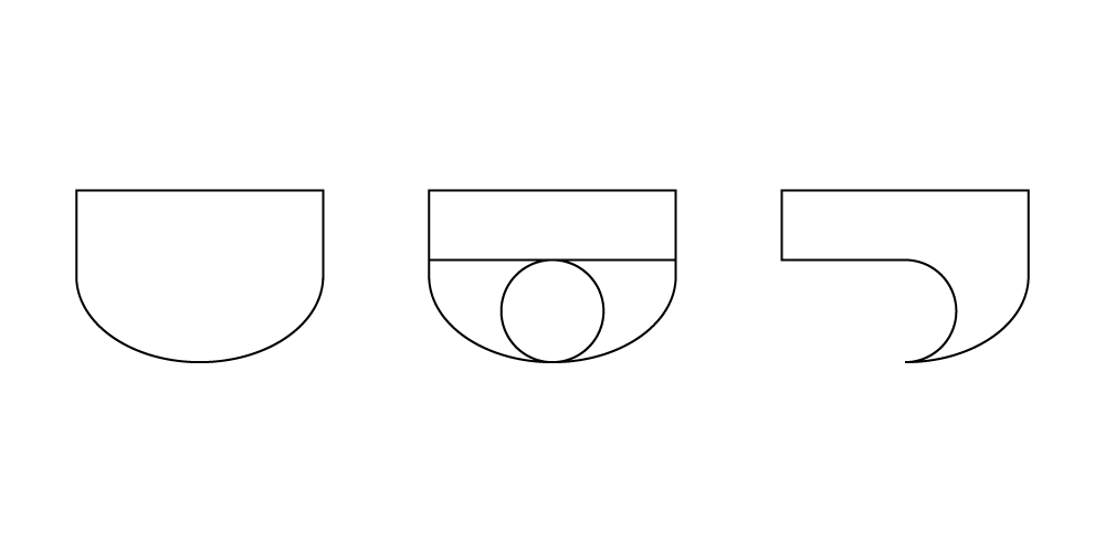
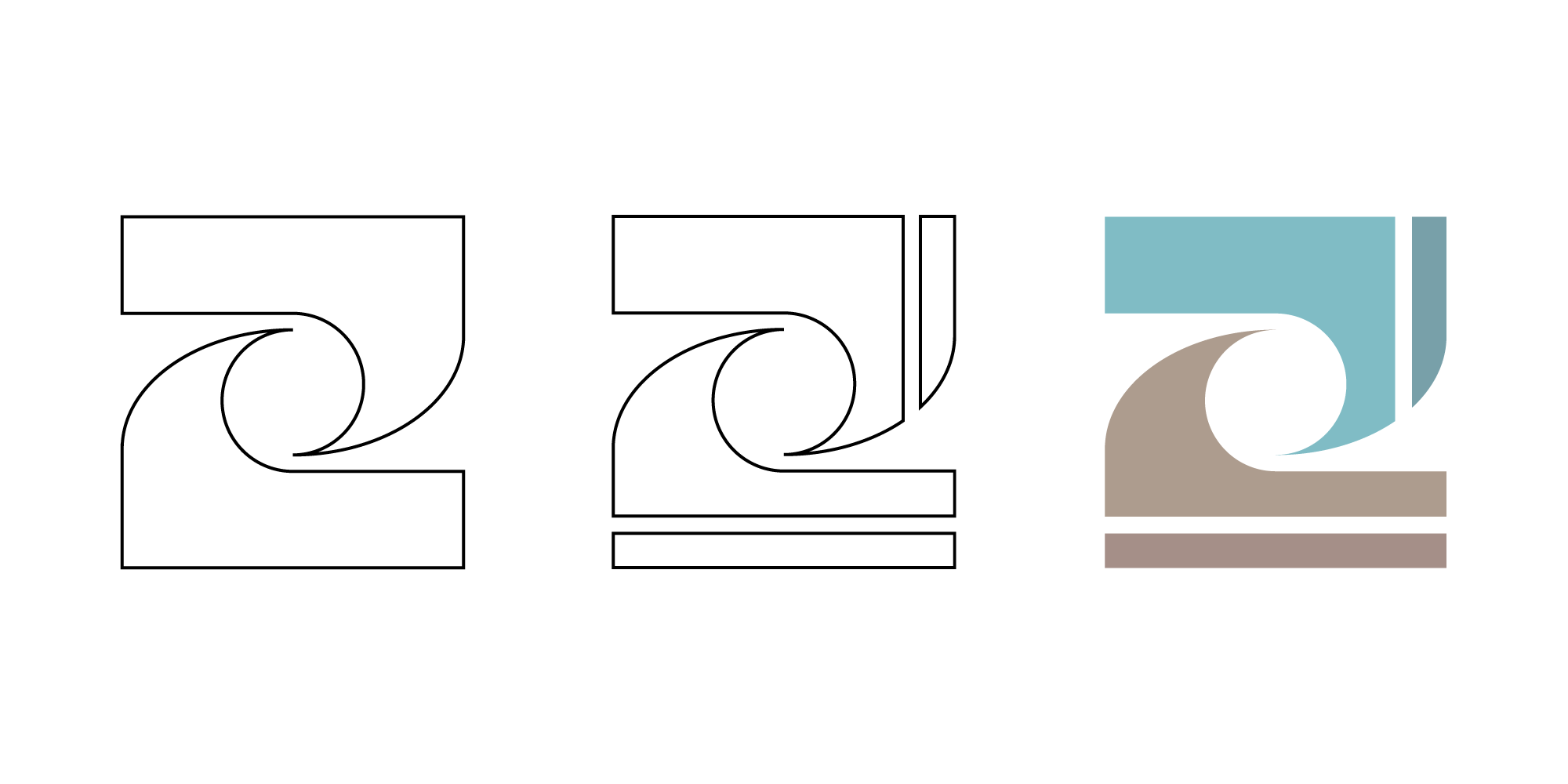
The logo began as an exploration of simple geometric forms inspired by the movement of wind and water. Curves were layered, rotated, and refined to create a sense of continuous motion while bringing two distinct natural forces together within a single form.
The final mark balances fluidity with structure, creating a symbol that feels organic yet intentional. Its interlocking forms reflect the idea of energy in motion while reinforcing the sense of balance and harmony at the heart of the Wind and Wave brand.
Building the Identity
Bringing symbol, typography, and color together into a cohesive identity.
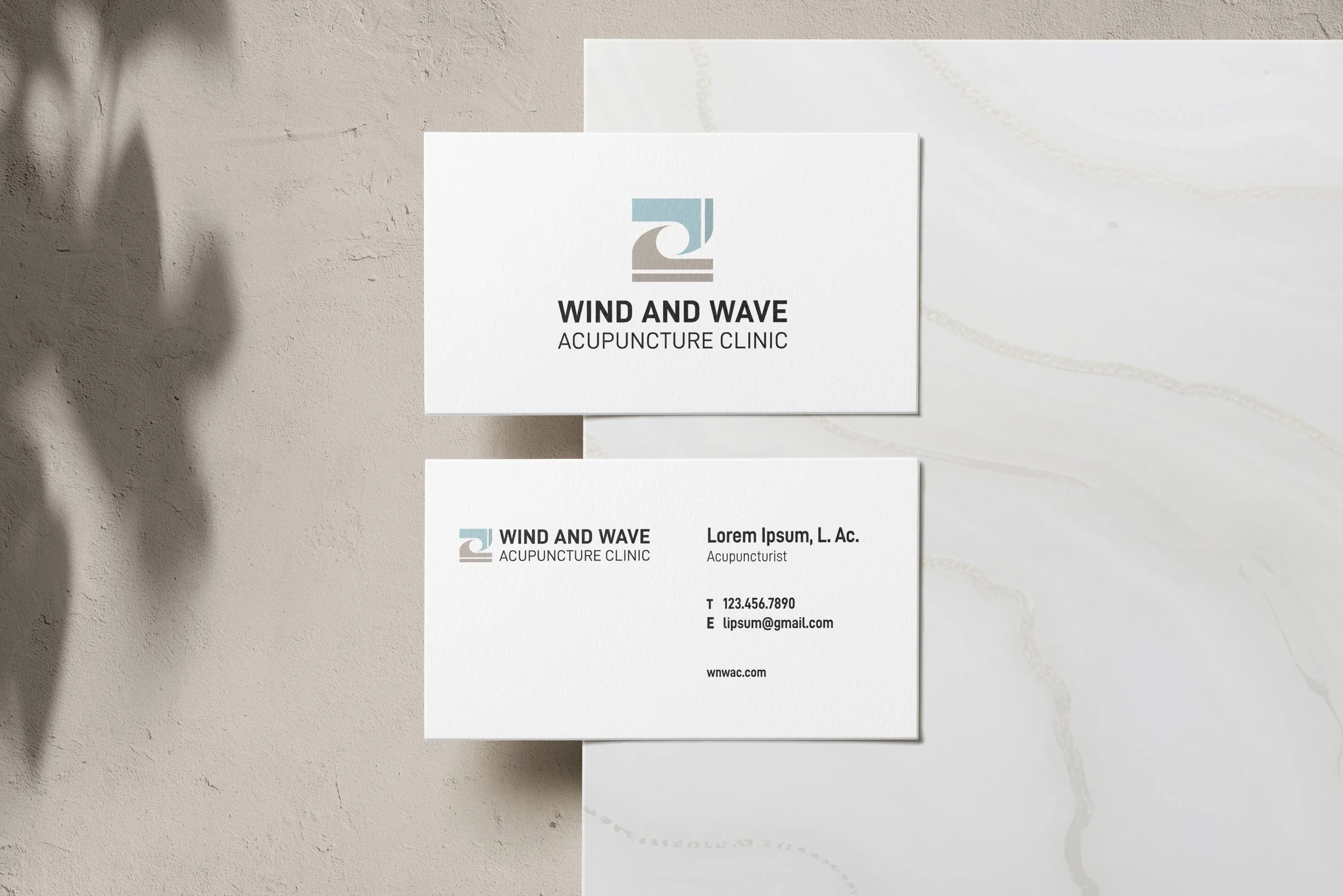
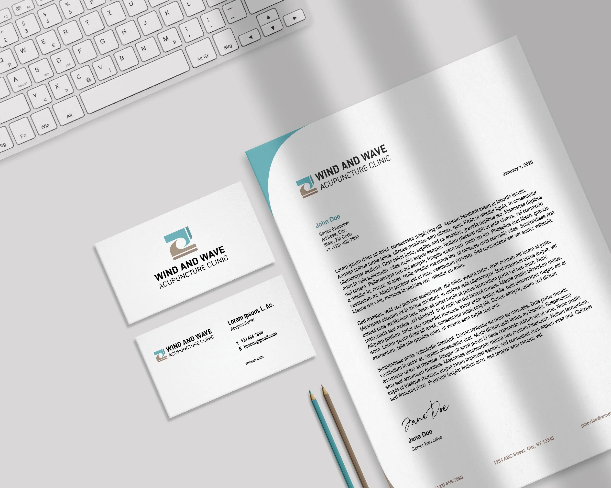
With the core mark established, the identity was expanded through typography, color, and a flexible logo system. Clean, modern typography provides contrast to the organic movement of the symbol while maintaining a calm and approachable presence.
Horizontal and stacked logos were developed to provide flexibility across different formats and scales, creating a consistent identity that could adapt across print and digital applications.
Primary Logo Horizontal

Secondary Logo Stacked