Legat Architects Brand Refresh
Turning a refreshed identity into a cohesive brand system
Following a website redesign and visual refresh developed in collaboration with an external creative agency, Legat Architects introduced a more modern typographic approach and a new family of graphic elements while retaining the core of its existing identity.
I led the implementation of the refreshed brand across the firm, developing a comprehensive set of guidelines and redesigning key marketing materials to create a unified visual language. From business collateral and presentation templates to proposals and large-format event graphics, the new system established a recognizable brand presence across different touchpoints while remaining flexible for evolving communication needs.
ROLE
Brand Implementation Lead, Visual Design & Production
PROJECT TYPE
Brand Systems, Brand Implementation
CLIENT
Legat Architects
TOOLS USED
Adobe InDesign, Illustrator, Photoshop, Microsoft PowerPoint
From Refresh to System
Creating a framework for a refreshed identity
The refreshed identity introduced a more modern typographic approach and a new set of graphic elements, creating an opportunity to rethink how the Legat brand was expressed across the firm.
The next challenge was turning that visual direction into a system that could work consistently across a wide range of applications. I focused on establishing clear guidelines and a flexible design framework that could bring greater consistency to existing marketing materials while helping teams to apply the brand confidently moving forward.

EXISTING IDENTITY

REFRESHED VISUAL DIRECTION
Defining the Brand
Turning brand principles into clear, usable guidelines
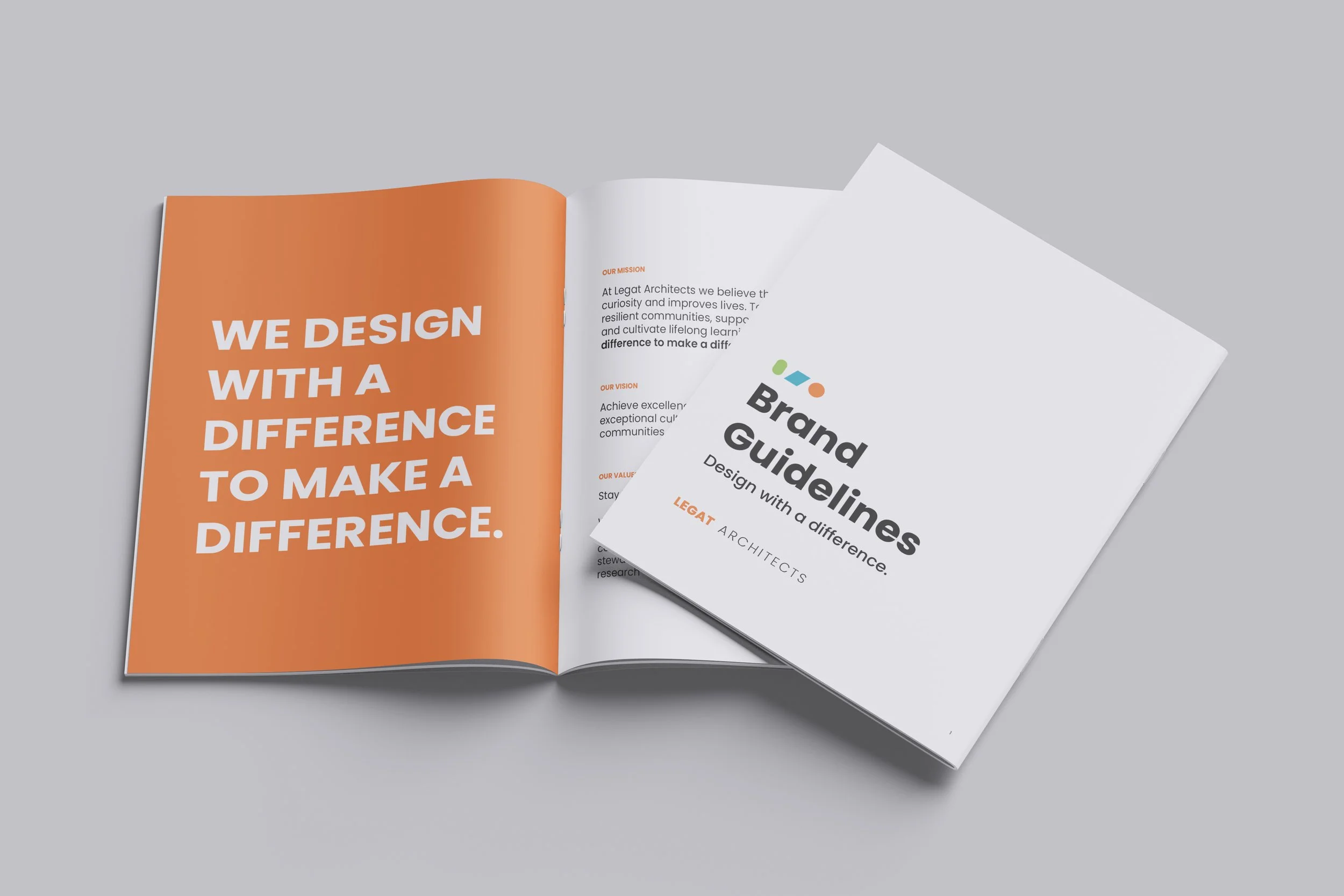
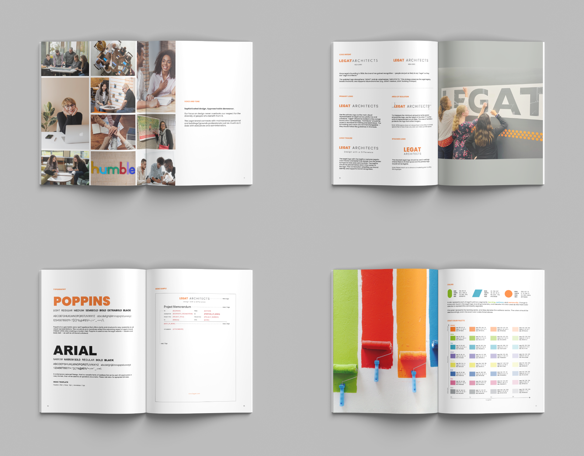
To create consistency across the firm, I developed a comprehensive brand guidelines book that translated the refreshed identity into a clear framework for how the Legat brand should look, feel, and communicate.
The guidelines brought together brand attributes, voice and tone, logo usage, typography, color, graphic elements, photography, and storytelling principles into one practical resource. By establishing both visual standards and broader communication principles, the guide gave teams a shared foundation for applying the brand consistently across different platforms and materials.
Bringing the Brand into Everyday Use
Creating consistency across everyday touchpoints
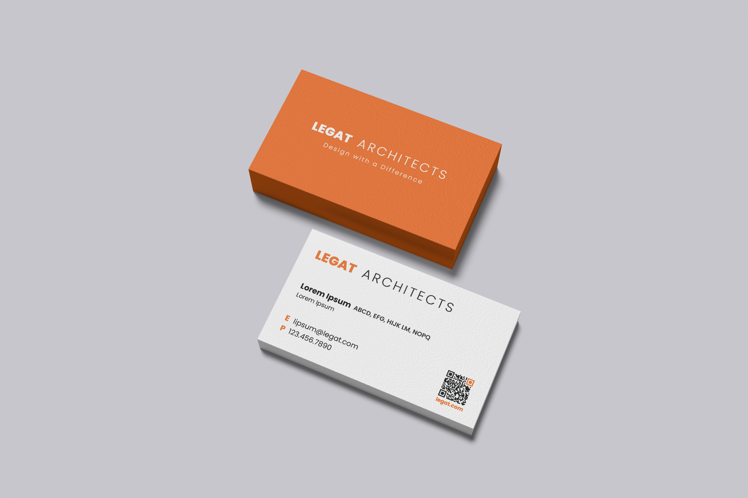
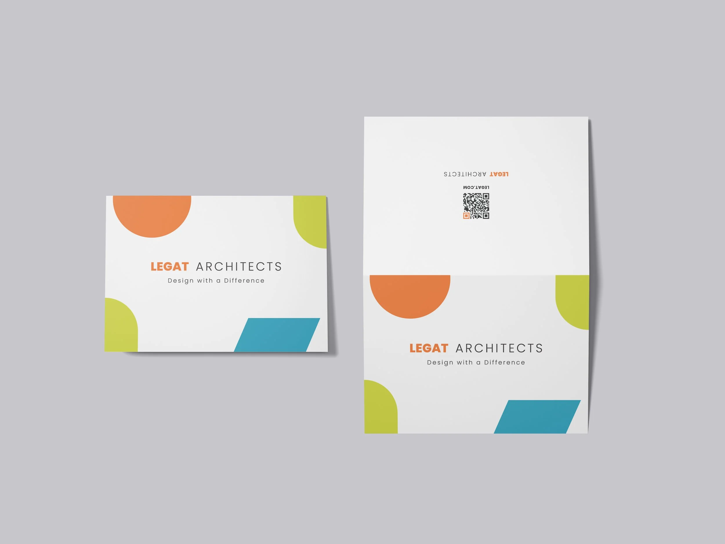
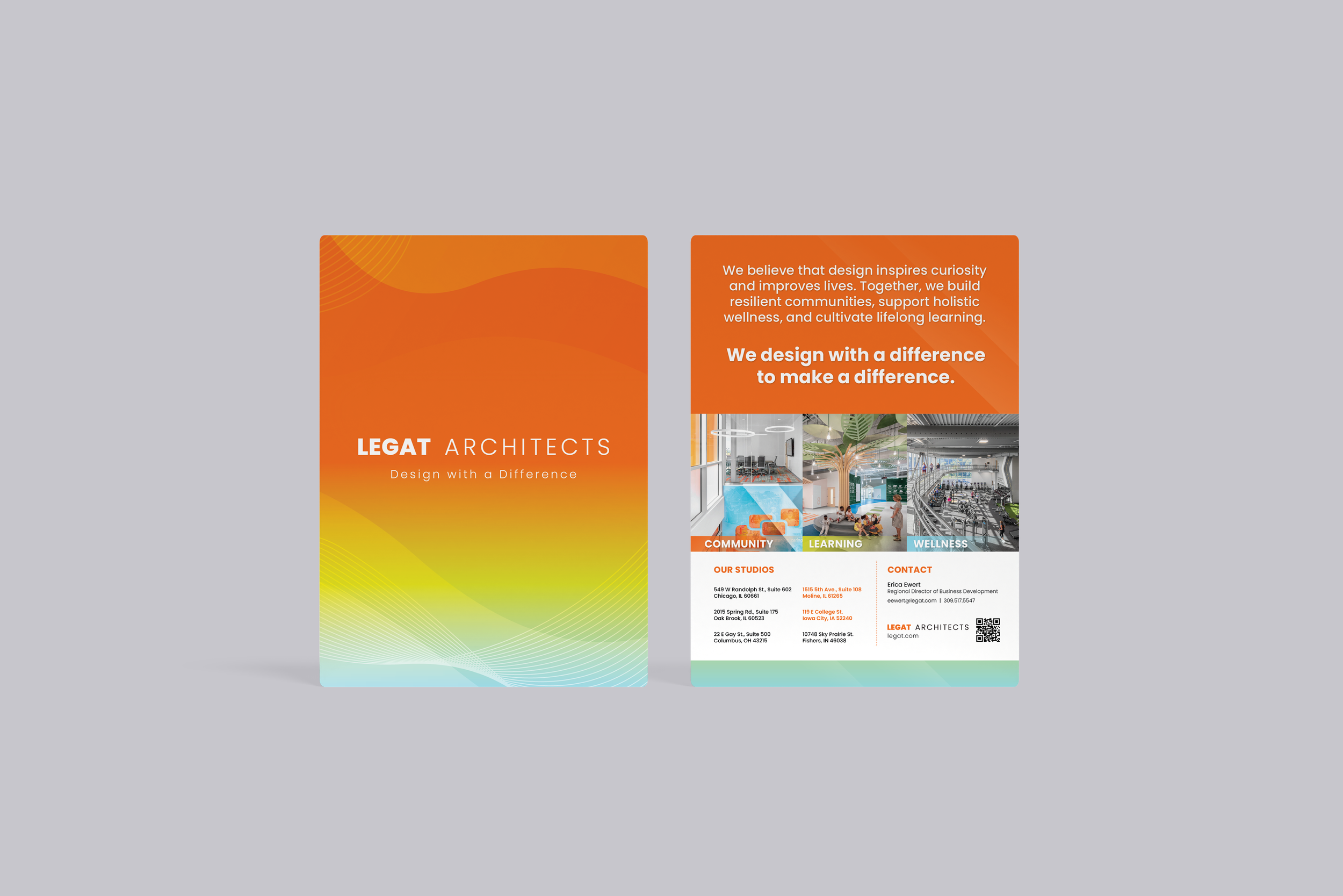
The refreshed identity was extended into everyday brand touchpoints, from business cards to greeting cards. Each application uses the same core visual language while adapting its expression to fit the purpose, balancing consistency with the flexibility to feel distinct across different formats.
Designing Tools for Consistency
Making the brand easier to use across the firm
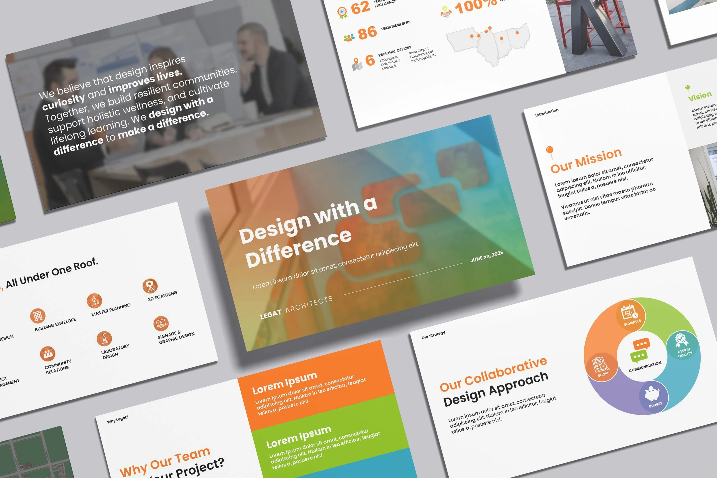
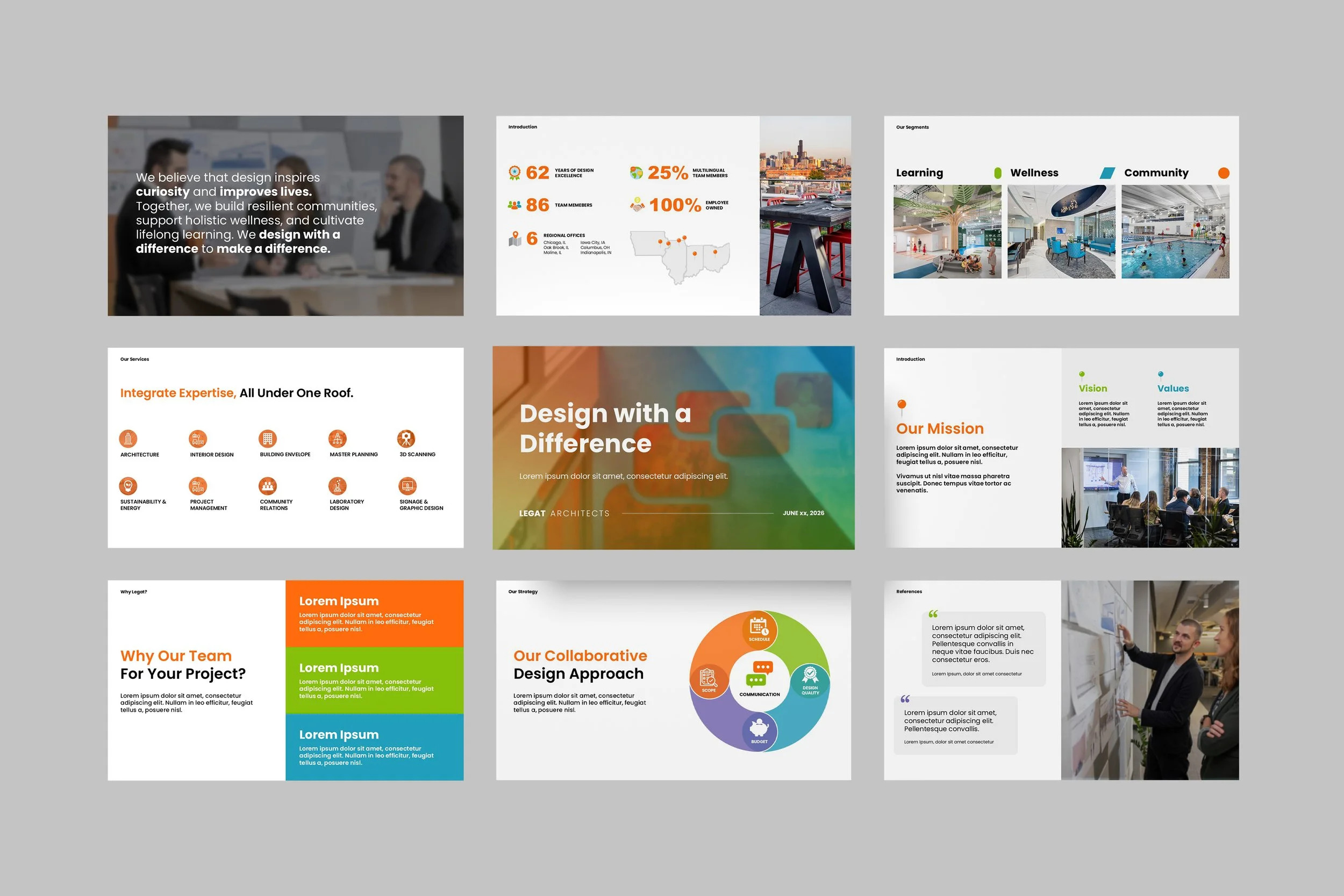
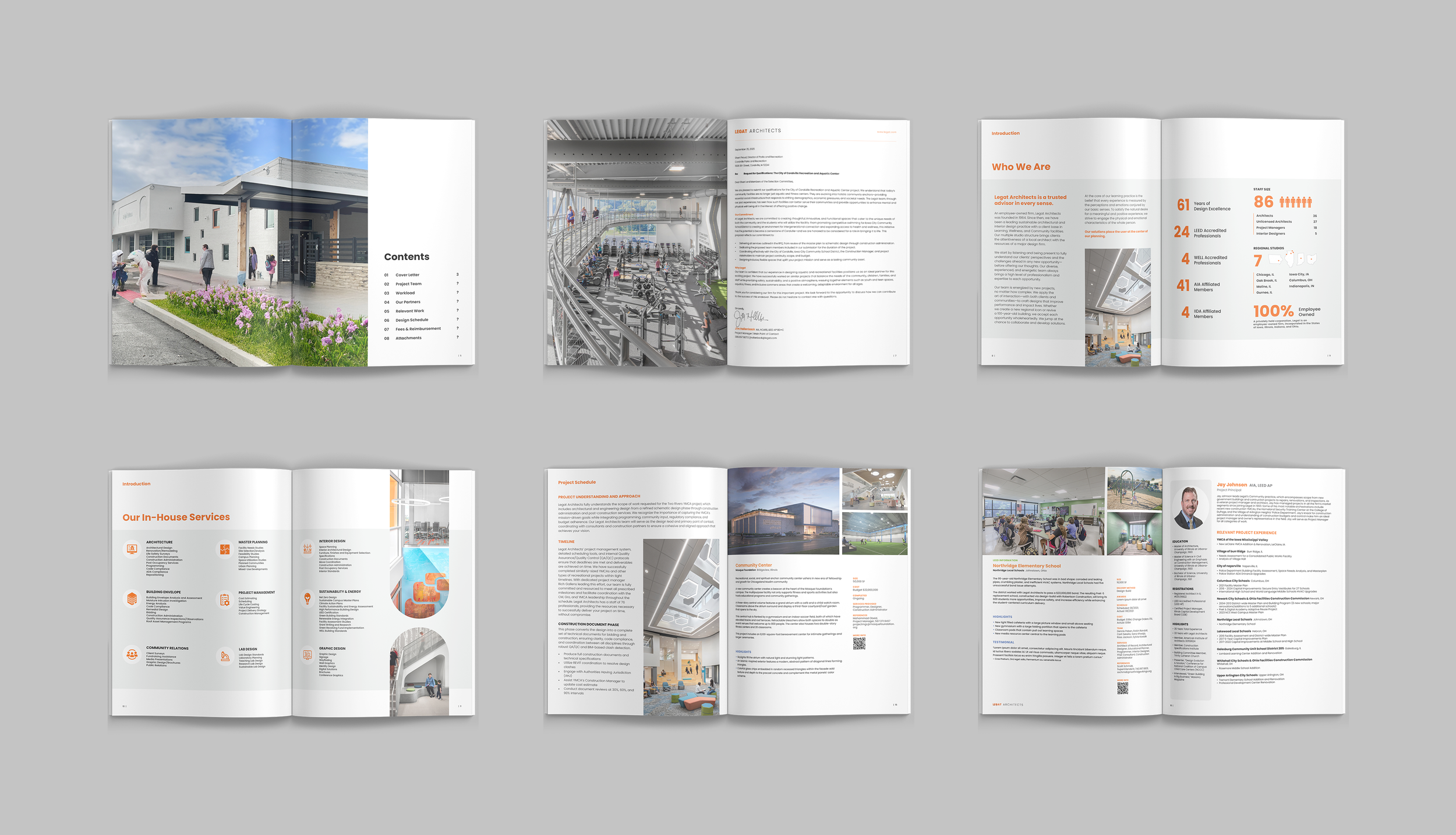
To extend the refreshed identity beyond individual marketing pieces, I developed reusable PowerPoint and proposal templates that gave teams a consistent starting point for creating branded communications.
The templates balanced clear visual standards with the flexibility to accommodate different content, audiences, and project needs. By building the brand directly into everyday tools, teams could create consistent communications while adapting layouts to fit the story they needed to tell.
Extending the Brand into Space
Scaling the identity for larger experiences
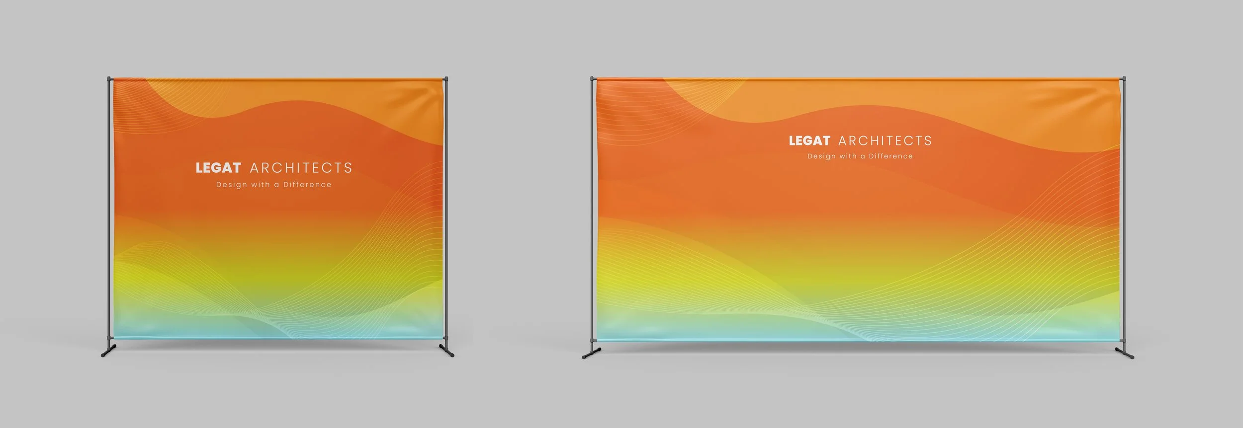
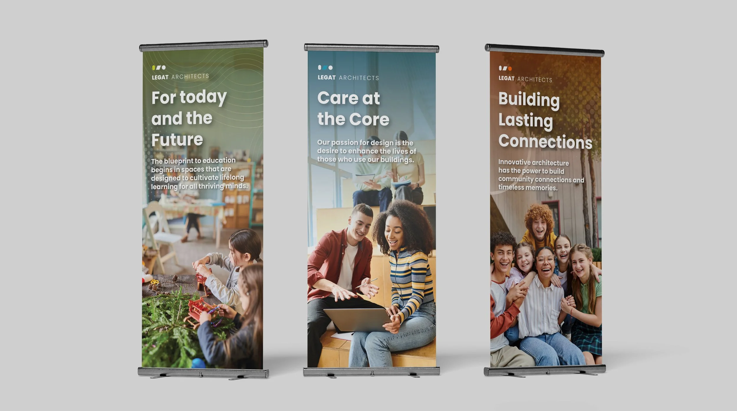
The visual system was extended into large-format event applications, including branded backdrops and retractable banners. Typography, color, imagery, and graphic elements were adapted to create a strong, recognizable presence at a larger scale while maintaining consistency with the broader brand system.